
Wallaby - Mobile App Redesign
BACKGROUND
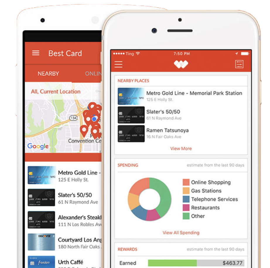
Wallaby was an app for iOS and Android that helped users know which credit card to use when shopping. I worked as a Sr. UX designer on a small team that consisted of a UX director and one other UX designer. Here is a quick overview of our design process.
OUR BUSINESS GOALS
• Increase bank connections by 10%
• Increase number of sessions and session time by 50%
• Increase retention/conversion of new users into active users by studying which actions led to conversion for the last 20 users
USER RESEARCH
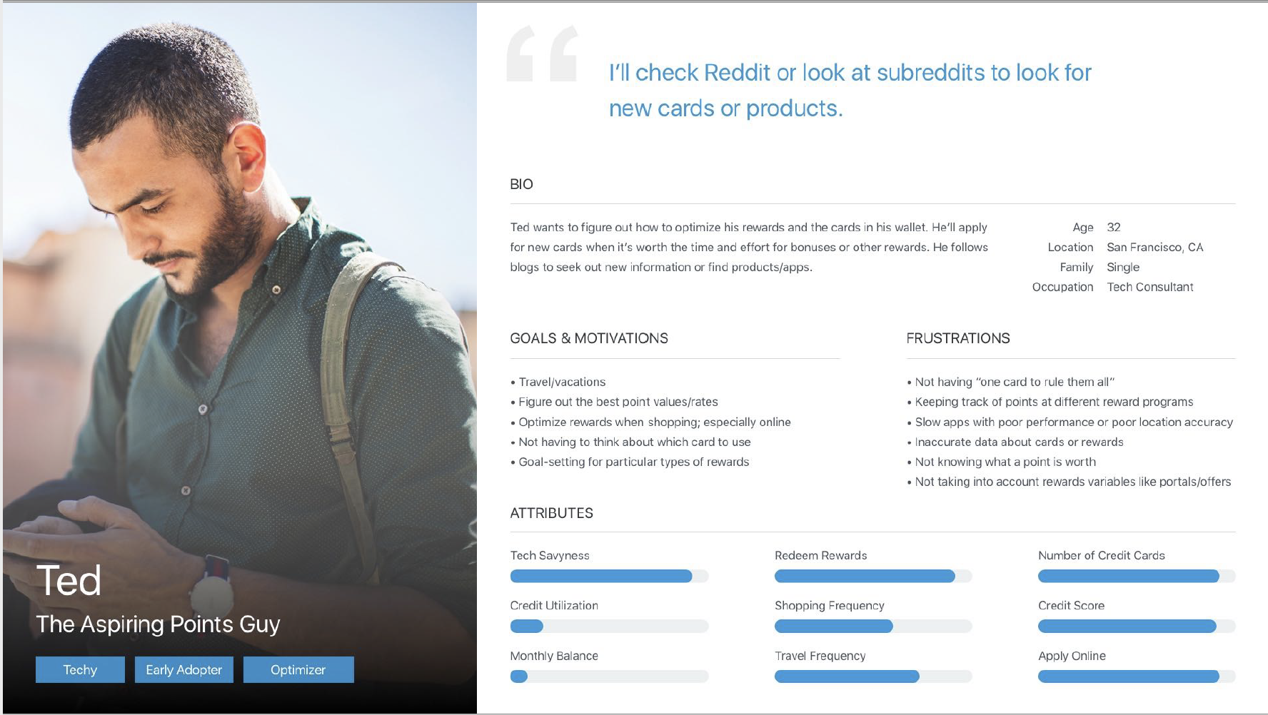
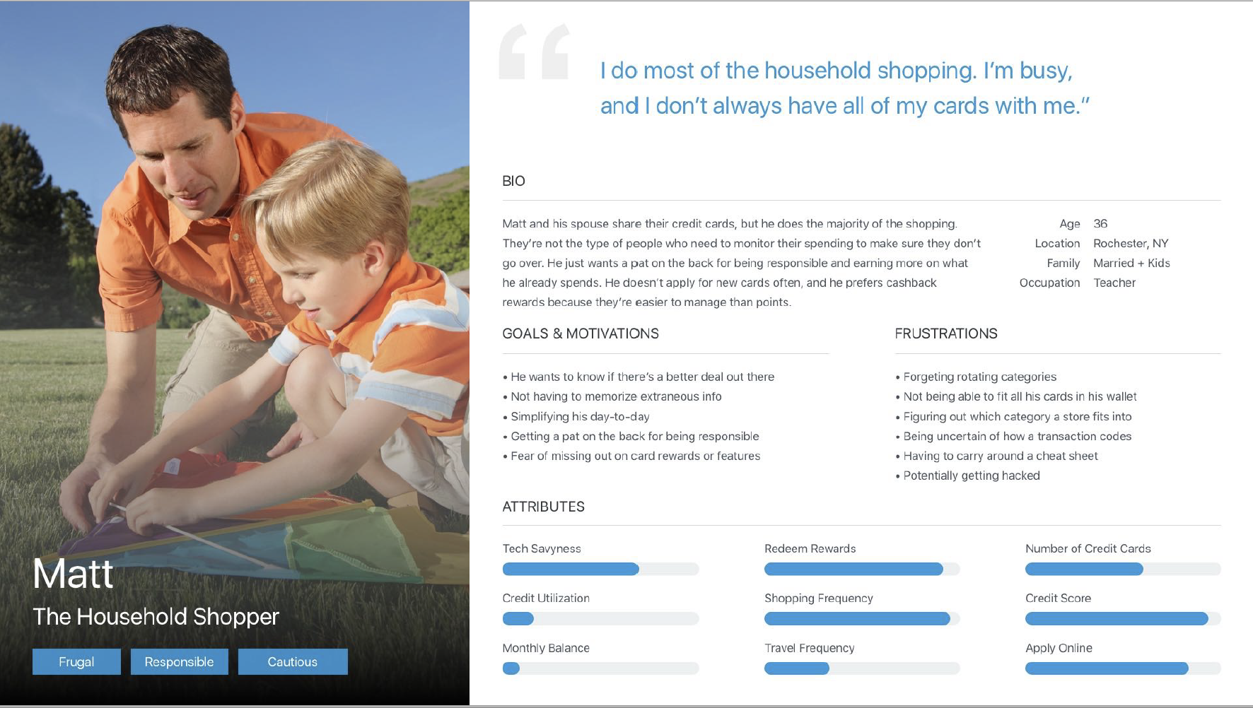
We looked at data from our analytics teams to see what features our customers were currently engaging with, but we needed more qualitative information. I conducted surveys, UserTesting sessions, and phone interviews with customers to gain insight into how people used our app and what they liked and disliked. This led us to our customers’ main pain points and helped us create personas to inform our designs.
PAIN POINTS
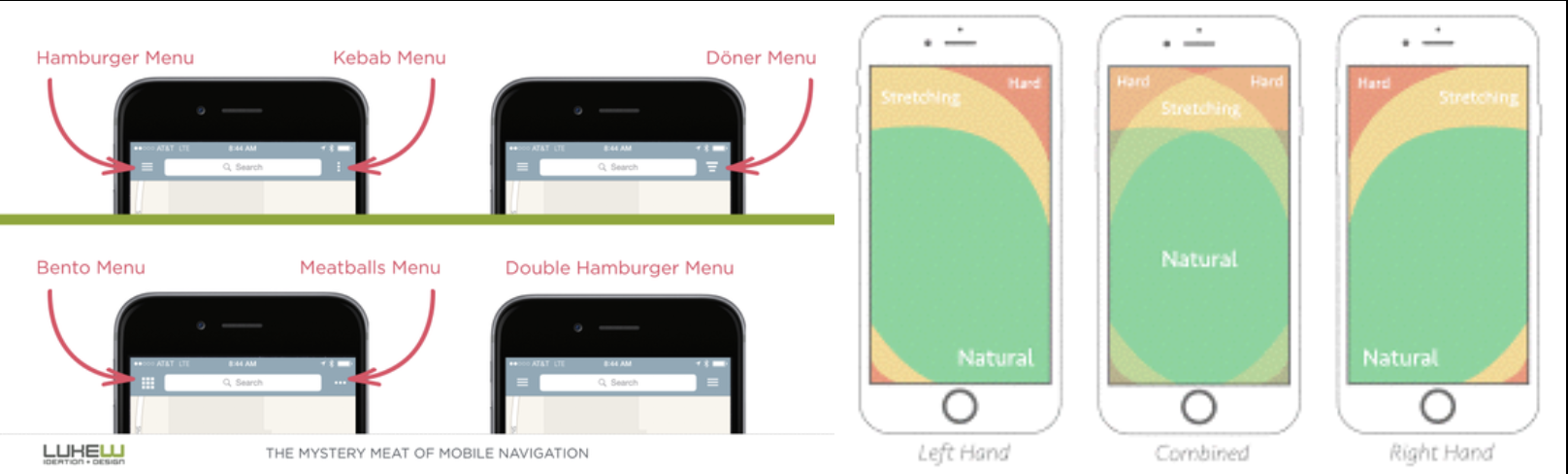
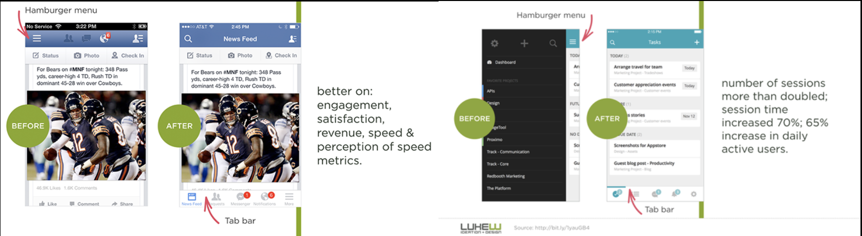
• Difficult to navigate hamburger menu
• Performance was too slow—especially at checkout
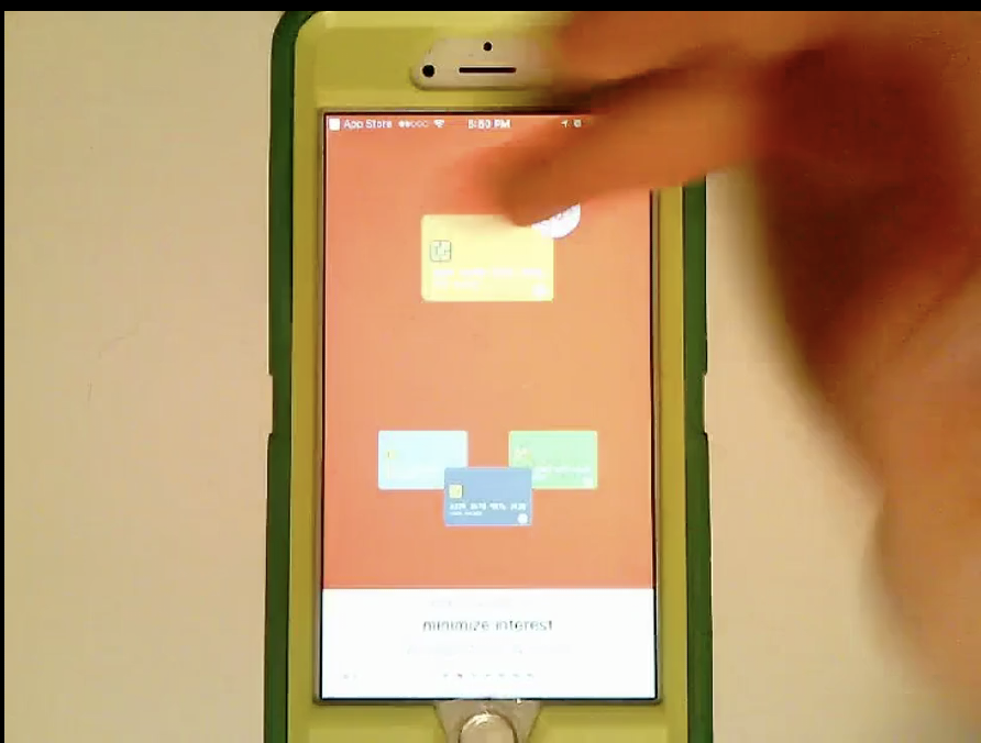
• Users needed a quick way to remember rotating category rewards
• Top user benefits were unclear to new users
• Some new users were worried about security and handing out their credit card numbers or details
• Credit card pages were missing information about benefits details
Best practices
Since the hamburger navigation was a big issue for users, we researched best practices from other apps. Using a bottom navigation made it easier to switch between top-level views within a single tap from anywhere in the app for both iOS and Android.
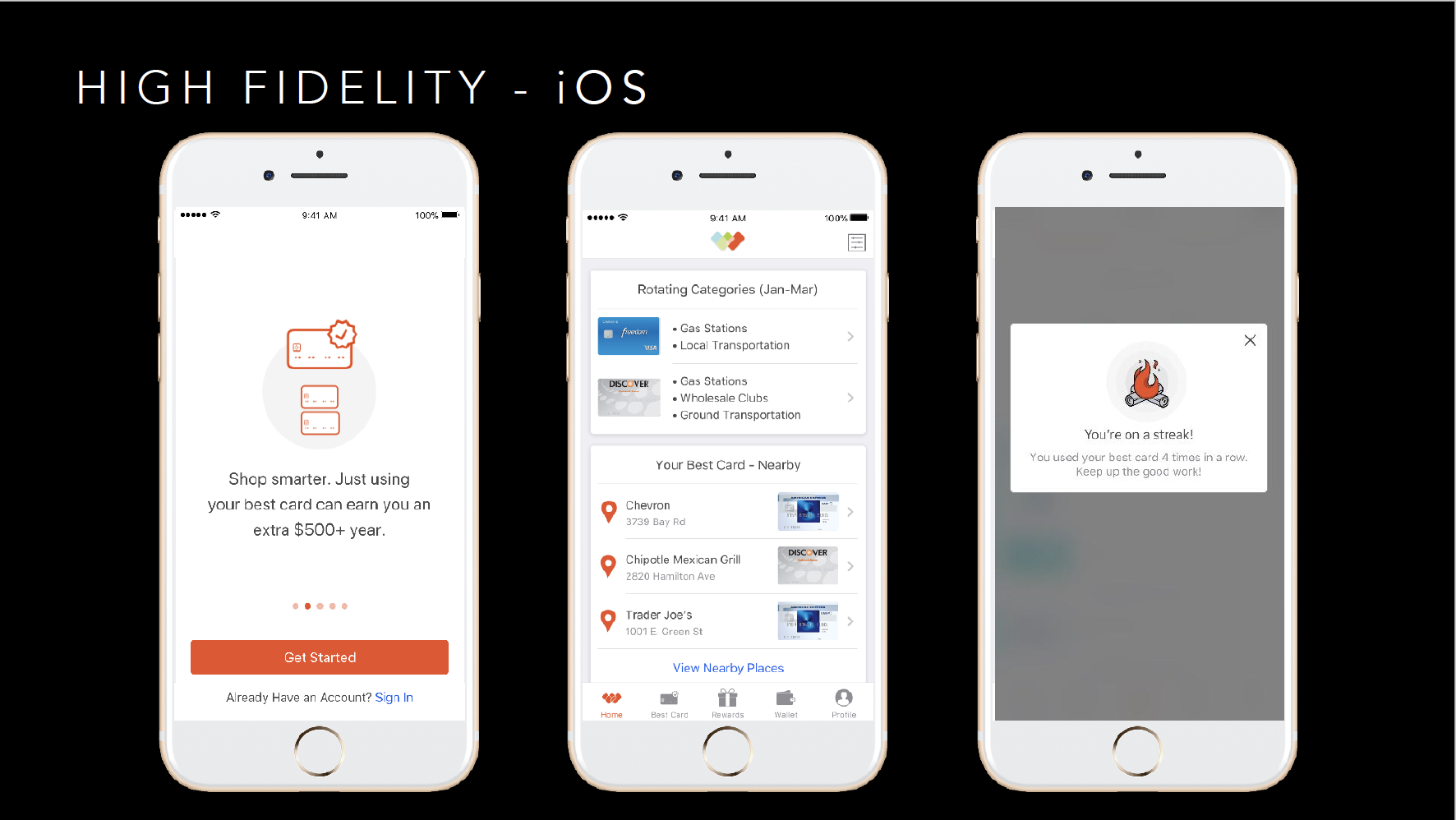
USER FLOWS / LO-FI Prototype
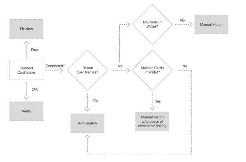
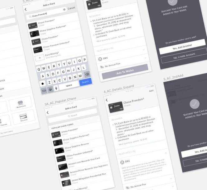
I created user flows and wireframes to go over how people encountered connecting banks and onboarding, so we could have discussions about changes with product and engineering. I used our flows and wireframes to go over complex interactions with our team and before committing to visual design. View the prototype here.
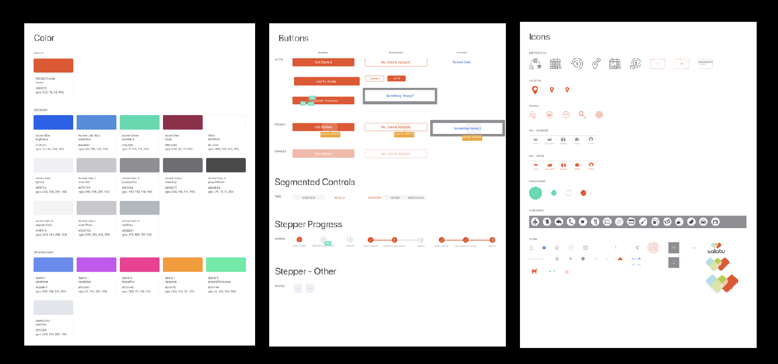
STYLEGUIDE / UI
We created a design system to make it easier for our developers to know exactly what to build and created annotated specs in Zeplin.
RESULTS / NEXT STEPS:
Our average visit length improved 25%, weekly user retentions (of 3+ visits) increased 24%, and bank connections increased 26 %. We would have liked to do more usability testing with the new app to gain more feedback/insight into the new designs and use those findings towards redesigning our white labeled apps.